
Analysis of a music magazine front cover
Conclusion
In conclusion this front cover by Q magazine has helped me in various different ways. Its hlped me to understand how I will need to position my models for my magazine and what types of shots I need to take e.g. long shot or close up. Also Florence’s makeup is very vibrant so it automatically draws the readers in and I want to do this too, to some extent. The layout of the magazine is quite neat but also fun with the blue text which has given me ideas when it comes to what I want to add to my front page.
Denotations: The magazine cover contains a photograph that is in colour of a woman looking directly into the camera. It is a close up shot of her face and she has her hands on the side of her face. The background of the magazine is her hair; her hair is a bright orange to red colour. Near the top of the woman’s hair there is the Masthead ‘Q’ with Discover Great Music written underneath it and the colour theme is white, blue and red. There are 5 cover lines around her in bold and with a white font. There is a circular puff on the magazine that is blue and white with black text on it, the magazine has blue bullet points too which match each other. Also the bar code is in the bottom left corner.
Masthead: The masthead is very unique, it is in a white font but it is hard to distinguish whether the letter is sans- serif or serif because it is just one simple letter. As it is just a simple letter it shows that the letter itself is all that you did and it signifies the important and what it stands for, with only just this letter people are able to know the magazine straight away. It may be simple but it also shows effectiveness with the flick of the ‘Q’. Originally the magazine was going to be called Cue (as in the sense of cueing a record, ready to play) but the name was so that it wouldn’t be mistaken for a snooker magazine. The tile is white on red so it makes it bold, so it stands out better. The colours used are white and red which contrast against each other. The red is very eye-catching and will catch the readers’ eyes easily. The fact that the magazine is called’ Q’ shows simplistic and maturity which suggests that there is an older target audience
Character: The woman on the front of the magazine is Florence, and she is part of a band called Florence and the Machine, a very well-known artist/band in the UK.
Composition: Not much of her is posed, the main shot is just her face, but the way her hands are placed by the sides of her cheeks, and this shows a very elegant image of her and shows her as powerful too.
Costume: the costume that has been chosen for Florence is not visible this may indicate that she isn’t wearing any clothes or that it is insignificant to show it. It is a close up as the photographers want to focus more on her face and facial features. Her face is very pale and this is done purposely to add effect. Florence has a nude lip but it’s bright enough to know that she is wearing lipstick. Her eyes are the main focus as her costume, she has a bright eye which draws the reader directly into them and as it is a bright blue, the blue really stands out from her pale face, this connotes that her style is unique which fits with her music. However, if you carry on looking at her, she looks almost a bit fragile
NVC: Her Nonverbal communication is in a way seductive as she has her lips slightly open, the way her hair surrounds her and her hands are placed, makes her seem very feminine with only her facial expression, which shows that’s he doesn’t need to be revealing in order to be sexy.
Lighting: The lighting is high key, the light hitting the main point in the article and that is Florence’s face which makes her seem very flawless and the use of it is effective because it directly draws you in.
Setting: You are not able to see a setting here and the background is just her hair, which makes it seem like the setting and where she is placed isn’t important and it carries on the idea that she’s the main focus.
Target audience: The magazine is likely to be targeted at males and females who are ages 30- 40. The type of artists featured on this magazine would be music types that people of a slightly older generation would have listened to when they were younger, and still do. The magazine features a variety of artists from different genres so it would interest a wider range of people. They are likely to be more mature readers and have a good interest in a lot of English styled music.
Cover-lines: The main cover-line that relates to her in the photograph says “I feel so alone” Florence the woman on the edge. In the image she does look a bit fragile too so that relates to her. The cover-line automatically gives us a sense that she isn’t going to be talking about her music career, nor an upcoming concert, but she will be talking about something person because the cover line has emotive language in it ‘alone’ which will automatically draw the reader in and they will want to read this article to know why she feels that way, whys she’s on the edge and if any of them can relate to her. The different cover-lines tell us that the magazine doesn’t focus just on Florence and her type of music, for example it talks about ‘skrillex’ he is a very upbeat DJ; his music is nothing like Florence’s music. Also the magazine doesn’t only focus on music either as it talks about having to ‘meet a new Simon Cowell’ which opens the magazine to a wider audience. The magazine also focus’ on upcoming events, because in big it has the word ‘GIG’ which will attract anyone who wants to have fun and enjoy themselves. It also has a cover line on there that says ‘Heroin hooker & hair metal motley crue & the bands that won’t die’ the use of heroin and hookers mean that this story is going be quite heavy as drugs are involved and possibly even sex, it creates the idea of how bands that have been around a few years are acting, this makes them conform into the stereotype that is they think that they can do what they want and have gotten into a mess because maybe their music careers just aren’t what they used to be.
Content page analysis


Content analysis
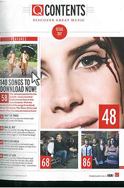
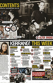
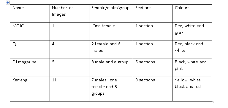
As you can see by my research, throughout my four magazine contents page I have noticed many similarities in them. The magazines tend to all use white in them, this may be for writing or background but usually it’s the background as in the three magazines I researched they have white backgrounds. Music magazine Q, Mojo and Kerrang use red for text, less in Kerrang than the other two. Also another convention that has occurred is that in three of my magazines black is used for either background or text. Usually the trend is to have three colours but it varies depending on the magazine, as the Kerrang magazine I chose uses four colours. The sections on the magazines that I have researched vary. MOJO and Q are similar as they both have only one section, whereas Mixmag and Kerrang give a variety of columns, DJ magazine has five and Kerrang has nine. There is no specific gender that is prominent, there is a variation but from the magazines that I have researched there tends to be more men in them. The numbers of how many people are featured in the magazine also vary which shows it just depends on the magazine and that there is no rule on how many people to feature on it. In addition this is the same for the amount of pictures used in the contents page, there is no pattern between the contents pages I have researched, this shows that it doesn’t matter how many images there are, as long as it is effective it will work.
What will this mean for my contents page?
With the research I have conducted of the contents page they have given me some inspiration and made me think about what I’m going to do to my contents page. From what I have seen in MOJO, Q and DJ magazine there seems to be a pattern of how many colours used, the general theme is only three colours, this would be effective for me to use because it’s not simplistic but it doesn’t over complicate it. The colours used are very deliberate in these content pages and they all contrast each other especially in Q and DJ magazine I really like how the pink contrasts from the white so I think that although red is a popular colour, having white and black would be formal and may seem a bit dull so I think that if I use a bright colour such as yellow or blue it will stand out a lot more and make it more eye catchy. There is no general pattern of how many images there needs to be but I think that I will use a minimum of three images and a maximum of four images in order to give a variety. From the research I have conducted I think that by having three sections in my contents page it will work well for me because I don’t want to have too much going on but enough. I will be having a section that says ‘features’ and this will have information on different artists such as talks on upcoming events, talks on their new much, news etc.… also I will want to have a quiz such as who are you most like and one that will have alum reviews. I think that by having an album review then the readers are able to acquire an opinion for it. My colour scheme, just has many magazines will be a three based one and I will be doing blue, white and yellow because I think that these colours will work well together and they are bright colours. Also my aim is to photograph both a female and male so that it’s not one sided based on gender because the look I aspire to go for, I want to have a variety to see how it will turn out. The kind of photos I will take will be a mixture of medium close up/ close up to medium long shot because by having the image reveal most of the model it will show the costume I have in mind for them. I want them to have an on trend look with their clothing but with an edge, I may make the makeup edgy or the clothing so that it doesn’t just look like I’ve taken a photo of a normal person, but that I’ve actually thought about it.